데이터 분석/데이터 시각화
matplotlib
fullfish
2025. 10. 24. 17:14
파이썬에서 가장 기본적이고 강력한 시각화 라이브러리로,
데이터 분석 및 머신러닝에서 그래프를 그릴 때 가장 자주 사용
코랩에서 matplotlib 한글 적용법
!apt-get install -y fonts-nanum
!rm -rf /root/.cache/matplotlib

한 후에 런타임 -> 세션 다시 시작

import matplotlib.font_manager as fm
import matplotlib.pyplot as plt
from matplotlib import rc
# 1. 실제 폰트 파일 경로 지정
font_path = '/usr/share/fonts/truetype/nanum/NanumGothic.ttf'
# 2. 폰트 이름 얻기 (matplotlib 내부명)
font_name = fm.FontProperties(fname=font_path).get_name()
print("matplotlib이 인식한 폰트 이름:", font_name)
# 3. 폰트 적용
rc('font', family=font_name)
plt.rcParams['axes.unicode_minus'] = False  # 마이너스 깨짐 방지

실행 하면 한글 나옴
# matplotlib.pyplot 주요 함수 정리
plt.plot(x, y) # 선 그래프(Line Plot) 작성
plt.scatter(x, y) # 산점도(Scatter Plot) 작성
plt.bar(x, y) # 막대그래프 작성
plt.hist(data) # 히스토그램 작성
plt.pie(data) # 파이차트 작성
plt.xlabel("레이블") # x축 이름 설정
plt.ylabel("레이블") # y축 이름 설정
plt.title("그래프 제목") # 그래프 제목 설정
plt.legend() # 범례 표시
plt.grid(True) # 격자 표시
plt.show() # 그래프 출력
plt.xlim('Jul', 'Dec') # 표시 범위 설정
plt.ylim(3000, 6000)
plt.axis(['Jul', 'Dec', 3000, 6000]) # x, y 축 한번에 설정# 마커(marker) 스타일
markers = {
'o': '원(circle)',
's': '사각형(square)',
'^': '위쪽 삼각형',
'v': '아래쪽 삼각형',
'>': '오른쪽 삼각형',
'<': '왼쪽 삼각형',
'd': '마름모(diamond)',
'D': '큰 마름모'
}
# 선(line) 스타일
linestyles = {
'-': '실선(solid line)',
'--': '점선(dashed line)',
'-.': '점-선 혼합(dash-dot line)',
':': '점선(dotted line)',
'None': '선 없음(마커만 표시)',
'': '선 없음(마커만 표시)'
}
예제
x = [1, 2, 3, 4, 5]
y = [10, 5, 8, 12, 7]
plt.plot(x, y, color='blue', marker='o', linestyle='--', label='매출 추이')
plt.title('월별 매출 그래프')
plt.xlabel('월')
plt.ylabel('매출액(만원)')
plt.legend()
plt.grid(True)
plt.show()
x = [1, 2, 3, 4, 5]
y1 = [10, 8, 6, 4, 2]
y2 = [2, 4, 6, 8, 10]
plt.plot(x, y1, label='감소')
plt.plot(x, y2, label='증가')
plt.title('두 가지 추세 비교')
plt.legend()
plt.show()

labels = ['A', 'B', 'C', 'D']
values = [10, 24, 36, 18]
plt.bar(labels, values, color=['skyblue', 'orange', 'green', 'red'])
plt.title('카테고리별 값')
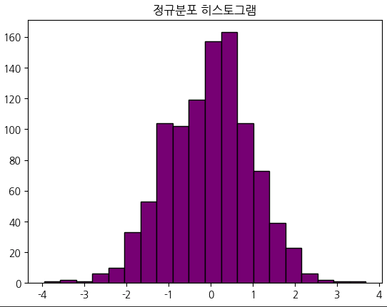
plt.show()data = np.random.randn(1000) # 정규분포 난수 생성
plt.hist(data, bins=20, color='purple', edgecolor='black')
plt.title('정규분포 히스토그램')
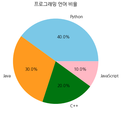
plt.show()labels = ['Python', 'Java', 'C++', 'JavaScript']
sizes = [40, 30, 20, 10]
colors = ['skyblue', 'orange', 'green', 'pink']
plt.pie(sizes, labels=labels, colors=colors, autopct='%1.1f%%')
plt.title('프로그래밍 언어 비율')
plt.show()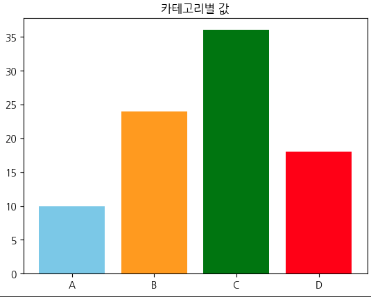
data = {
'공부시간': [1, 2, 3, 4, 5, 6, 7, 8, 9],
'성적': [40, 45, 50, 55, 60, 70, 75, 80, 85]
}
df = pd.DataFrame(data)
# 산점도
df.plot(x='공부시간', y='성적', kind='scatter', color='purple')
plt.title("공부시간과 성적의 관계")
plt.xlabel("공부시간(시간)")
plt.ylabel("성적(점수)")
plt.grid(True)
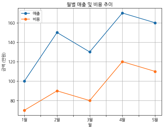
plt.show()data = {
'월': ['1월', '2월', '3월', '4월', '5월'],
'매출': [100, 150, 130, 170, 160],
'비용': [70, 90, 80, 120, 110]
}
df = pd.DataFrame(data)
df.plot(x='월', y=['매출', '비용'], marker='o')
plt.title("월별 매출 및 비용 추이")
plt.xlabel("월")
plt.ylabel("금액 (만원)")
plt.grid(True)
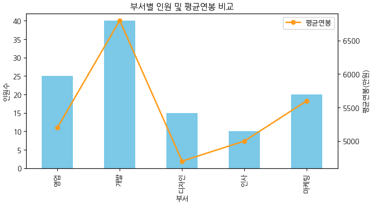
plt.show()data = {
'부서': ['영업', '개발', '디자인', '인사', '마케팅'],
'인원수': [25, 40, 15, 10, 20],
'평균연봉': [5200, 6800, 4700, 5000, 5600]
}
df = pd.DataFrame(data)
# 막대그래프 (이중 축 활용)
ax = df.plot(
x='부서', y='인원수', kind='bar', color='skyblue', legend=False,
figsize=(8,4)
)
ax2 = ax.twinx() # 오른쪽 y축 추가
df['평균연봉'].plot(ax=ax2, color='orange', marker='o',
linewidth=2, label='평균연봉')
ax.set_ylabel("인원수")
ax2.set_ylabel("평균연봉(만원)")
plt.title("부서별 인원 및 평균연봉 비교")
plt.legend(loc='upper right')
''' 위에 줄 대신 이거 쓰면 legend 두개 합쳐져서 나옴
bar, label1 = ax.get_legend_handles_labels()
line, label2 = ax2.get_legend_handles_labels()
ax.legend(bar + line, label1 + label2, loc='upper right')
'''
plt.show()
x = np.linspace(0, 10, 100)
y1 = np.sin(x)
y2 = np.cos(x)
plt.figure(figsize=(10, 4)) # 가로 세로 크기 (inch)
# 첫 번째 그래프
plt.subplot(1, 2, 1)  # 1행 2열 중 첫 번째
plt.plot(x, y1, color='blue')
plt.title("sin(x)")
plt.subplot(1, 2, 2)  # 1행 2열 중 두 번째
plt.plot(x, y2, color='red')
plt.title("cos(x)")
plt.tight_layout()  # 여백 자동 조정
plt.show()
fig, axes = plt.subplots(2, 2, figsize=(8, 6))
axes[0, 0].plot(x, np.sin(x))
axes[0, 0].set_title("sin(x)")
axes[0, 1].plot(x, np.cos(x))
axes[0, 1].set_title("cos(x)")
axes[1, 0].plot(x, np.tan(x))
axes[1, 0].set_title("tan(x)")
axes[1, 1].hist(np.random.randn(1000))
axes[1, 1].set_title("Histogram")
plt.tight_layout()
plt.show()

fig, ax = plt.subplots(nrows=1, ncols=1, figsize=(6, 4))
core = pd.Series(
    [1340, 1500, 2400, 3500, 4500, 5000, 5500, 4900, 4200, 3000, 2000, 1500],
    index=['Jan', 'Feb', 'Mar', 'Apr', 'May', 'Jun', 'Jul', 'Aug', 'Sep', 'Oct', 'Nov', 'Dec']
)
ax.plot(score, 'gs-')
major_y = np.arange(1300, 5700, 400)
minor_y = np.arange(1500, 5700, 400)
ax.set_yticks(major_y)
ax.set_yticks(minor_y,minor=True)
ax.set_yticklabels([f'{v} point' for v in major_y])
ax.set_yticklabels([f'{v} point' for v in minor_y],minor=True)
ax.grid(True, color='blue')
plt.show()
month = ['March', 'April', 'May', 'June']
data = {
'name': month,
'english': [80, 90, 100, 95],
'chinese': [100, 80, 70, 85],
'korean': [95, 100, 80, 60],
'math': [90, 70, 60, 100]
}
fig, axes = plt.subplots(2,2, figsize=(8,6))
row, col = 2,2
# axes[0,0].plot(data['name'],data['english'], 'ro--')
# axes[0,0].set_yticks(np.arange(60,101,10))
# axes[0,0].set_title('English')
# axes[0,0].grid(True)
# axes[0,1].plot(data['name'],data['chinese'], 'gs--')
# axes[0,1].set_yticks(np.arange(60,101,10))
# axes[0,1].set_title('chinese')
# axes[0,1].grid(True)
# axes[1,0].plot(data['name'],data['korean'], 'b^--')
# axes[1,0].set_yticks(np.arange(60,101,10))
# axes[1,0].set_title('korean')
# axes[1,0].grid(True)
# axes[1,1].plot(data['name'],data['math'], 'm''--')
# axes[1,1].set_yticks(np.arange(60,101,10))
# axes[1,1].set_title('math')
# axes[1,1].grid(True)
subjects = ['english', 'chinese', 'korean', 'math']
styles = ['ro--', 'gs--', 'b^--', 'mo--'] # magenta(보라)로 수정
titles = ['English', 'Chinese', 'Korean', 'Math']
# axes를 1차원 배열로 만들어 반복 처리
for ax, subject, style, title in zip(axes.ravel(), subjects, styles, titles):
ax.plot(data['name'], data[subject], style)
ax.set_yticks(np.arange(60, 101, 10))
ax.set_title(title)
ax.grid(True)
plt.tight_layout()
plt.show()


x = np.arange(1, 11)
y1 = 3 * x ** 2
y2 = 2 * x ** 3

plt.plot(x, y1, "ro--", x, y2, "gs--")
plt.annotate('hear',(8,1030),(3,1550), arrowprops={'color':'red'})
plt.text(8.6, 100, '$y=3x^2$')
plt.text(8.6, 1100, '$y=3x^3$')
plt.grid(True)
plt.show()
names = ['group_a', 'group_b', 'group_c']
values = [10, 50, 100]
graphs = [plt.bar, plt.scatter, plt.plot]
plt.figure(0, figsize=(10, 3), facecolor="#ACFF44")
for number, graph in enumerate(graphs, start=131):
plt.subplot(number)
graph(names, values)
plt.show()
